Some of you know that we are working on a new website design and structure. We have a specific building block where we'd like to hear some feedback, because the two options we have both have their drawbacks and positive aspects: the feature block.
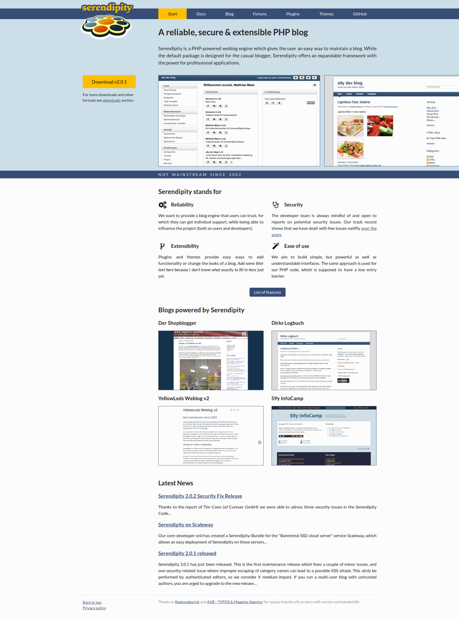
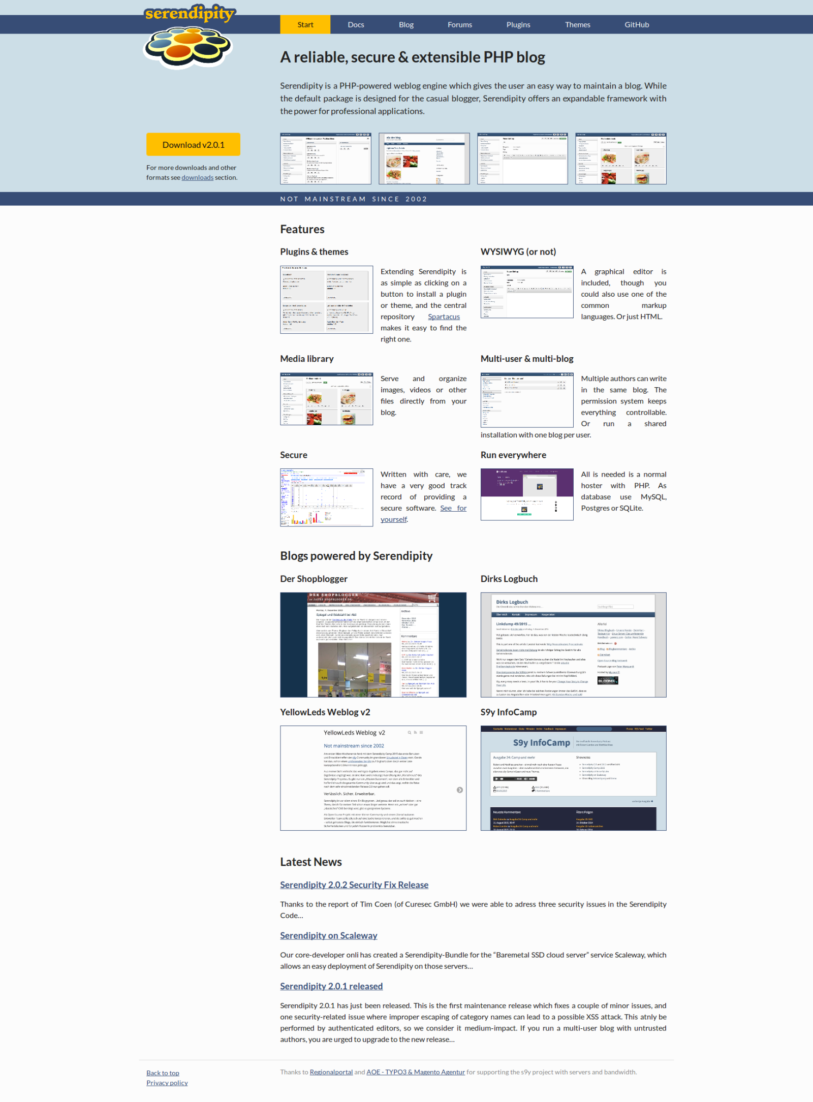
Have a look at the current website. One thing we'd like to preserve is that the page shall present some features of serendipity, just with better text and presentation. For that, we have two designs:
One, Two
Note that the relevant difference is the first section under the colored section, the one called "Serendipity stands for" in the first and "Features" in the second. Also that the screenshots in both versions are temporary and to be improved regardless.
Please have a look, vote for which you like more and let a comment if you want to qualify your vote. The poll will remain open one week so that we can then move on.
Feedback wanted: Features section of new website
Re: Feedback wanted: Features section of new website
Die erste Version wirkt aufgeräumter und optisch angenehmer. Sie erlaubt auch etwas mehr Text, also einen Teaser, und nicht nur Schlagworte.onli wrote:Please have a look, vote for which you like more and let a comment if you want to qualify your vote.
In der zweiten Fassung bleibt nur sehr wenig Platz für Text. Das wirkt sehr gedrängt und führt dann auch leicht zu Schwierigkeiten mit dem Zeilenumbruch, sieht daher nicht so schön aus.
Ich würde daher zusätzlich zur Version 1 einige Screenshots anbieten. Genug Platz auf der Seite wäre meines Erachtens.
----
The first version looks better - more tidy and visually more pleasant. It also allows a little more text, like a teaser, and not just some slogans.
In the second version there is very little room for text. That makes a very crowded impression and leads to some troubles with the spacing of the text, so does not look as nice as the first example.
I would enhance version 1 with some screenshots. There is enough space for that, in my opinion.
-
Lux
- Regular
- Posts: 764
- Joined: Fri Aug 12, 2005 4:36 pm
- Location: Grüt, Zürich, Switzerland
- Contact:
Re: Feedback wanted: Features section of new website
Too many pictures in version 2 and a bit of redundancy. Pictures explaining feature appear at the very top as well.onli wrote:Please have a look, vote for which you like more and let a comment if you want to qualify your vote. The poll will remain open one week so that we can then move on.
I voted for "one".
Cheers
Dirk
Re: Feedback wanted: Features section of new website
There are screenshots in the top section of the page. So you mean like an additional row of screenshots after the second section?thh wrote:I would enhance version 1 with some screenshots. There is enough space for that, in my opinion.
(Which, by the way, are not supposed to look the way they look in the first screenshot, which apparently has been taken in Firefox. That bug has since been fixed.)
YL
Re: Feedback wanted: Features section of new website
Sorry Matthias. I'll update the screenshot now.
Edit: No, I don't see the update in the branch. Are you sure the patch is pushed?
Edit: No, I don't see the update in the branch. Are you sure the patch is pushed?
Re: Feedback wanted: Features section of new website
Yes, but not in the branch, only in master. Doesn't matter, I think most people can tell that it's a bug. Just wanted to point out that it's already been ironed out.onli wrote:No, I don't see the update in the branch. Are you sure the patch is pushed?
YL
Re: Feedback wanted: Features section of new website
Guys, you are as decisive as we were ;)
Still, thanks a lot for the vote and feedback. I think we know what to do now.
Still, thanks a lot for the vote and feedback. I think we know what to do now.
-
DabblingInWebDesign
- Regular
- Posts: 10
- Joined: Mon Feb 01, 2016 9:39 am
Re: Feedback wanted: Features section of new website
I'm sure this post is coming way too late, but I think 1 is better. 2 is too crowded and overwhelming. 1 is cleaner and seems easier to consume and navigate.
Re: Feedback wanted: Features section of new website
We made some changes to it but basically went with 1: http://docs.s9y.org/
-
DabblingInWebDesign
- Regular
- Posts: 10
- Joined: Mon Feb 01, 2016 9:39 am
Re: Feedback wanted: Features section of new website
Very nice. I approve.
Re: Feedback wanted: Features section of new website
Looks good  .
.
One thing that hugely affects my decision in choosing a blogging platform or CMS is what their own site looks like. This site gives a good feeling for how well structured and simple Serendipity is.
One thing that hugely affects my decision in choosing a blogging platform or CMS is what their own site looks like. This site gives a good feeling for how well structured and simple Serendipity is.